Assignment: Creating graphs for your data
30 Jun 2016Program and outputs
%matplotlib inline
import pandas
import numpy
import seaborn
from matplotlib import pyplot

data = pandas.read_csv('gapminder.csv')
print('Total number of countries: {0}'.format(len(data)))
Total number of countries: 213
# Convert numeric types
data['incomeperperson'] = pandas.to_numeric(data['incomeperperson'], errors='coerce')

# Drop any countries with missing GPD
data = data[pandas.notnull(data['incomeperperson'])]

print('Remaining number of countries: {0}'.format(len(data['incomeperperson'])))
Remaining number of countries: 190
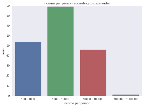
# Since GDP per person isn't categorical data, I'm going to group it by magnitude first
groups = [pow(10, i) for i in range(2, 7)]
labels = ['{0} - {1}'.format(groups[index], i) for index, i in enumerate(groups[1:])]
grouped = pandas.cut(data['incomeperperson'], groups, right=False, labels=labels)

grouped = grouped.astype('category')
graph = seaborn.countplot(x=grouped)
pyplot.xlabel('Income per person')
pyplot.title('Income per person according to gapminder')
# Now do the above for all of my consumption types
types = [
    ('alcconsumption', 'Alcohol Consumption'),
    ('co2emissions', 'CO2 Emissions'),
    ('internetuserate', 'Internet Use Rate'),
    ('oilperperson', 'Oil per Person'),
    ('relectricperperson', 'Electricity per Person'),
]

# Convert to numeric
clean = data.copy()
for (key, name) in types:
    clean[key] = pandas.to_numeric(clean[key], errors='coerce')

def draw_distplot(series, name):
    # Drop NaNs
    series = series.dropna()

    # Draw a distplot
    graph = seaborn.distplot(series, kde=False)
    pyplot.xlabel(name)
    pyplot.title('{0} according to gapminder'.format(name))

def draw_regplot(data, y, name):
    # Draw a regplot
    seaborn.regplot(x='incomeperperson', y=y, data=data, logx=True)
    pyplot.xlabel('Income per person')
    pyplot.ylabel(name)
    pyplot.title('{0} according to gapminder'.format(name))

for (key, name) in types:
    draw_distplot(clean[key], name)
    draw_regplot(clean, key, name)
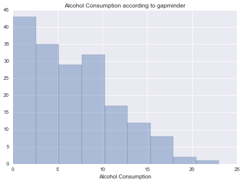
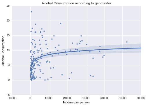
Alcohol consumption
 |
 |
Unimodal, skewed-right distribution.
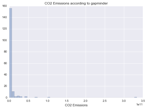
CO2 Emissions
 |
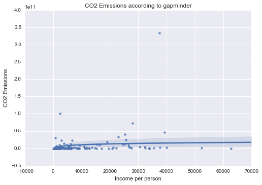 |
Unimodal, skewed-right distribution.
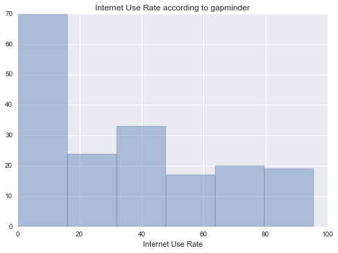
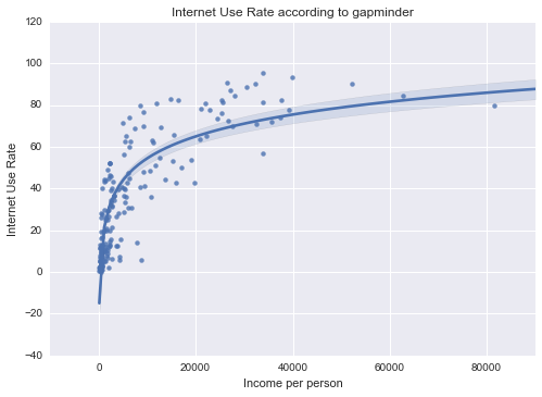
Internet Use Rate
 |
 |
Unimodal, skewed-right distribution.
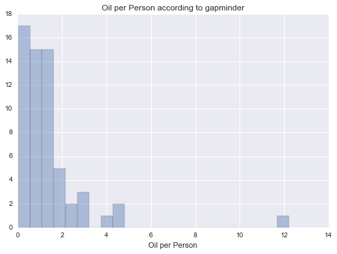
Oil per Person
 |
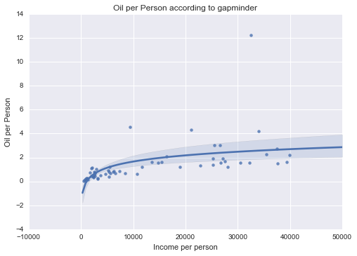 |
Unimodal, skewed-right distribution.
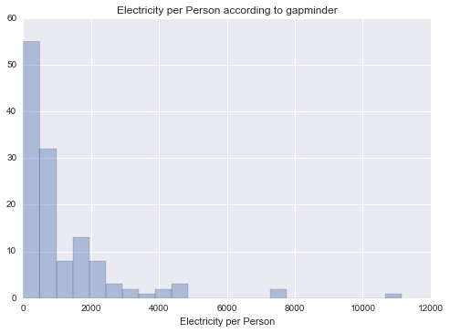
Electricity per Person
 |
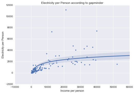 |
Unimodal, skewed-right distribution.
Summary
All of my measured variables were unimodal, and skewed-right. There was some correlation between my measured variables and Income per Person. In particular, Internet use rate was very closely correlated.